Overview
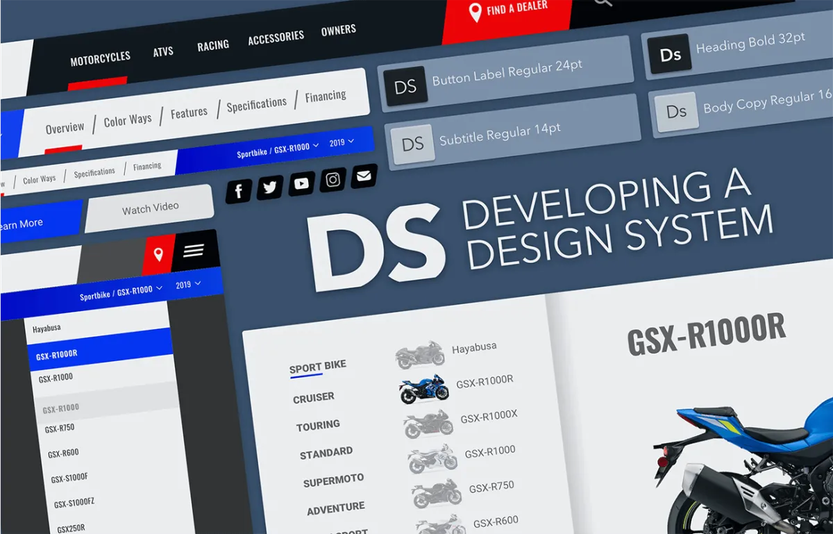
I had the privilege to join forces with the dedicated Questus team, embarking on the exciting journey of crafting a new website for a renowned Japanese motorcycle company. My initial task, as outlined by Questus, was to undertake the transformation of five fundamental top-level desktop pages, designed initially in Photoshop, into a responsive format. This intricate process involved leveraging the capabilities of Sketch and the Bootstrap grid system to seamlessly accommodate four distinct viewports: phone, tablet, small desktop, and large desktop.
Given the significance of this endeavor, as it marked the first redesign in over a decade, the stakes were indisputably high. I had anticipated a clear roadmap, comprehensive guidance, and an established style guide. However, reality proved to be more nuanced. Thankfully, I had a solid starting point thanks to the design compositions that had received client approval. Moreover, I was honored to join a highly talented and supportive design team consisting of Senior Designer Josh Garcia, ACD Sujeet Paul, and the seasoned Project Manager Olivia Choe.
The Questus team had invested numerous months collaborating with Manifest UX to develop a comprehensive set of wireframes that accounted for the intricacies of various interactions. The planned website was to be built with customizable, interchangeable components. While an audit of modules and desktop sizes was provided, my role involved expanding upon this foundation to encompass the diverse array of sizes across the four designated viewports.
Although a formal style guide was not at hand, the five top-level pages furnished to me contained sufficient color palettes, typography cues, and design elements to kickstart the creative process. The monumental task of designing each and every site element for all four viewports was estimated to consume approximately six weeks.

I started by collecting all assets which had already been created, specifically PSD files and the trove of UX designs in Zeplin. I was starting with only a hand full of pages in Photoshop. Every design element would be started from new in Sketch. Original files, new art boards, unique shapes, new symbols.
My process involved taking the PSD of the page I was working on converting it to Sketch using Avacode.com. Then cleaning up the converted files, grouping, renaming, adjusting spacing, etc.
This process proved time-consuming, monotonous, unscalable, and somewhat disheartening. It became apparent that there had to be a superior approach. And then, a revelation struck – the need for a design system emerged. A design system promised significant enhancements in efficiency for generating designs across various viewports, and crucially, it held the potential to streamline the development process significantly.

Planning
What steps should I take to establish a Design System for an intricate and expanding responsive website? Faced with this question, I embarked on a journey of analysis. I delved into articles, meticulously studied the comprehensive guidelines set forth by industry leaders like Google, Facebook, Apple, and Airbnb. Additionally, I scoured resources to connect with fellow designers who had encountered similar challenges

Audit
Armed with a preliminary plan, I systematically cataloged every UI element within the PSD files, meticulously documenting colors and fonts. I then proceeded to categorize these elements, observing distinct patterns. Notably, I identified multiple variations of button styles, font weights, and singular-use icons, resembling and divergent. Addressing these disparities, I meticulously rectified inconsistencies while crafting the corresponding elements in Sketch.

Edit
Navigating through the process, I confronted choices about naming conventions, categorization, arrangement, and visual representation. Much of my efforts were dedicated to thoughtfully labeling my Sketch layers and structuring the symbols page. Undoubtedly, this phase emerged as one of the most time-intensive aspects of the entire project

Evolve
Design Systems inherently exhibit a dynamic nature. At the end of each day, I followed a routine of transferring any newly crafted design work from Sketch to Zeplin. I meticulously documented any modifications within the changelog of the respective day's Sketch file. This comprehensive record was then shared with our collaborative design and development team using Dropbox, fostering seamless communication and progress tracking.

Think of a design system as a culinary guide, a compilation of design recipes and essential ingredients. Within its pages, you'll discover recipes for modules, carousels, menus, forms, and an array of other interface elements that designers and developers might require.
Resources
During my expedition, I chanced upon two indispensable resources that significantly enriched my journey: "Atomic Design" by Brad Frost, and a website known as Pattern Lab. Frost's Atomic design is a methodological approach to creating design systems that emphasize the hierarchical structuring of design elements, starting from small, indivisible components known as "atoms" and gradually assembling them into more complex and complete UI elements. At the same time, PPattern Lab provides a tangible resource of design systems in practical use.


Examples
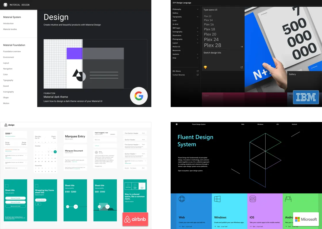
Prominent organizations such as Google, IBM, Airbnb, and Microsoft employ intricate and meticulously documented design systems that have not only inspired but also guided the creation of the design system. These comprehensive frameworks offer insights and standards for creating consistent, user-centered, and visually appealing digital experiences.


Problem
As I mentioned in the introduction, my design process, in the beginning, was slow, painful, and unproductive. However, under a tight deadline, taking time out to create a design system wasn't really in the cards. Create the design system in real-time was the only option.
Benefits
Some of the benefits of creating a design system include:
• Saving a lot of time.
• Ensuring UI consistency (often associated with increasing brand trust).
• Reducing complexity and ambiguity.
• Enabling and facilitating collaboration and consensus.
• Creating a foundation for further improvement.
• Creating a design system would make us faster, more accurate, and more flexible, reduce development time, and create a better, more robust product.
For a complete list of benefits, read InVision’s free Design Systems Handbook.

In the initial stages, the most time-intensive aspect was creating and meticulously tracking UI elements, coupled with the need to manage style variations across various font families. Devoting an entire day to the task, I defined the extensive range of weight and color styling possibilities for the selected typefaces.
Some of the more complicated things requiring concentrated thought were foundational items:
• Organization
• Naming conventions
• Capturing states
• Creating dynamic, nested symbols
• Adhering to Atomic Design Principles
Sharing
We used two methods for sharing. Zeplin was used to share our design system with the entire team to solicit feedback and promote collaboration. Internally the design team used Abstract to present design and UI versions for approval. Dropbox was used for the daily Sketch handoff to development.
Conclusion
Engaging in this project offered me a multitude of valuable lessons. It allowed me to dissect some of the most exemplary design systems currently in practice, refine my Sketch proficiency, and foster a collaborative learning process with the adept development team at Small Talk.
One aspect that surprised me was the profound impact of instilling consistency in the UI. The presence of uniform elements streamlined design iterations and expedited the approval process. It allowed us to examine requirements thoroughly, pinpoint design challenges, and then refer to our component library to guide us toward potential solutions. Witnessing firsthand the efficiency of a design system in resolving design issues was enlightening. The cohesiveness in the UI significantly curtailed unnecessary revisions, minimized design-related headaches, and translated into substantial time savings for our development counterparts.
During this journey, I also realized that my initial creation resembled more of a UI Kit than a comprehensive design system. The realization marked a starting point rather than an endpoint. We had commenced a dialogue, and the journey had only just begun.
The following stages require close collaboration with SmallTalk's developers to establish standardized code for existing elements, alongside crafting layout guidelines for creating novel patterns. Additionally, further research remains a constant necessity.
Thanks for reading!
f you are creating your own design system, or just want to learn more, check out the resources below:
• The UI Prep Syllabus on Design Systems
• Pattern Lab
• Free UI kits from sketchappresources
• This series of posts on how the team at Customer.io did it
• Atomic Design Book, by Brad Frost


